Cartogram of Population in Alaska
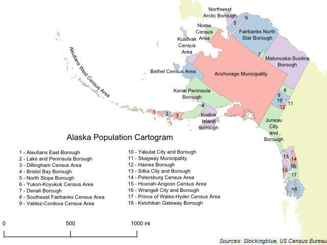
The geographically accurate cartogram above represents the size of the boroughs and census areas of Alaska based on their population. Anchorage makes up nearly half (41.09%) of the state's population and thus takes up a significantly larger portion of the state's landmass than it currently does.
Cartogram of Population in New York State
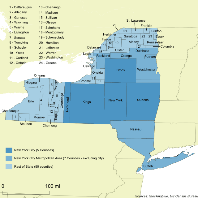
The geographically accurate cartogram above represents the size of the counties based on their population. New York City makes up nearly half (42.19%) of the state's population and thus takes up a much larger portion of the state's landmass than it currently does.
Cartogram of the 2017 Alabama Special Senatorial Race
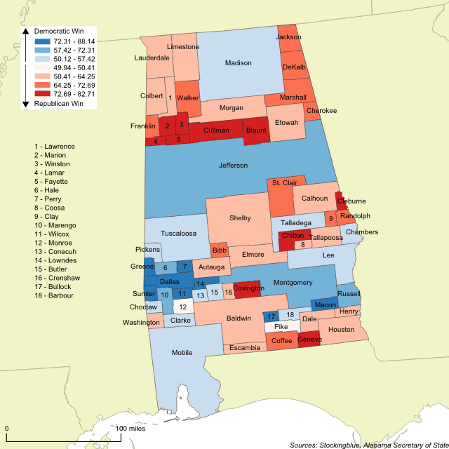
The geographically accurate cartogram above resizes the counties based on the number of votes cast in the Senate race between Republican Roy Moore and Democrat Doug Jones. The more votes cast in a county, the larger it is on the map. This cartogram shows that Jones won the four largest counties (Jefferson, Madison, Mobile, and Montgomery) whereas Moore won the fifth and sixth largest counties. It proved not to be enough to get him past the post.
What to Look for in the 2017 Alabama Special Senatorial Race
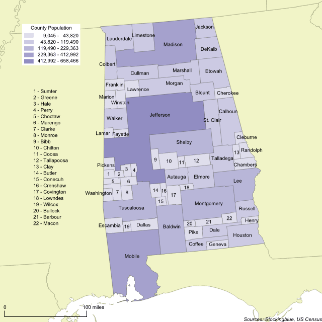
The geographically accurate cartogram above represents the population of Alabama's counties. The more populous a county is, the larger it is on the map. This cartogram shows that Jefferson, Madison, and Mobile are the most populous counties by far and together the three counties account for just under 30 percent of the state's total population. This, in a state with 67 counties.
Cartogram of Think Tanks in the United States
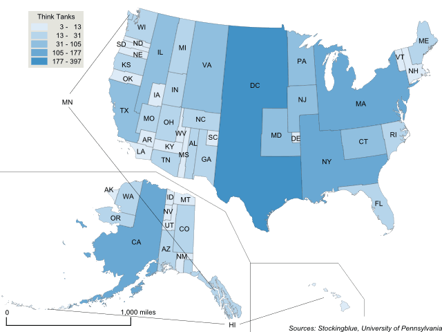
The geographically accurate cartogram above represents the size of the states based on their number of think tanks. Washington DC contains one out of every five think tanks in the US. Think tanks are clearly an east coast phenomenon.
Cartogram of Think Tanks in the European Union
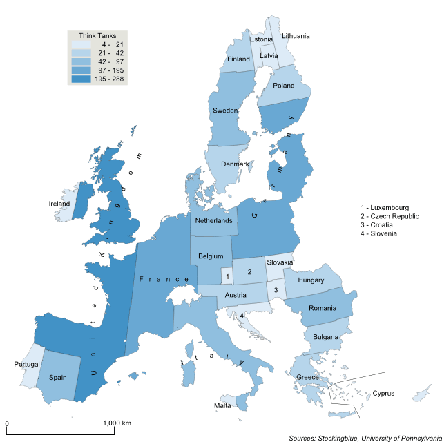
The cartogram above represents the size of the states of the EU based on the number of think tanks. The United Kingdom contains one out of every five think tanks in the Union. With its impending exit, the EU is poised to lose 20 percent of its think tanks.
Global Competitiveness in the European Union
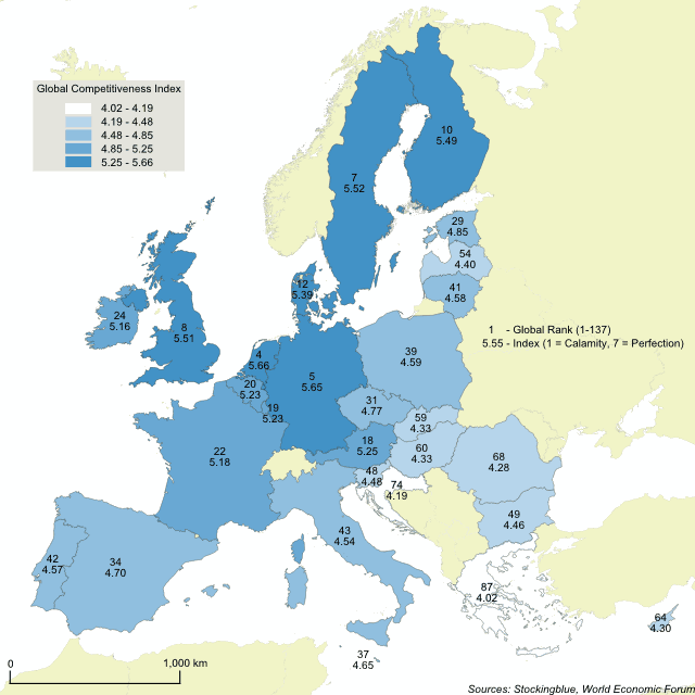
The World Economic Forum published its annual Global Competitiveness Index (GCI) recently and while some states of the European Union faired spectacularly others, not so much. Half of the world's top ten most competitive nations are in the EU, namely the Netherlands, Germany, Sweden, the United Kingdom, and Finland. The Index is made up of 114 factors ranging from property rights to reliability of police services and from the quality of roads to the prevalence of various diseases. These 114 variables are broken up into 11 categories or "pillars" as the Index puts it: institutions, infrastructure, macroeconomic environment, health and primary education, higher education and training, goods market efficiency, labor market efficiency, financial market development, technological readiness, market size, business sophistication, and innovation.
Oat Production in the European Union
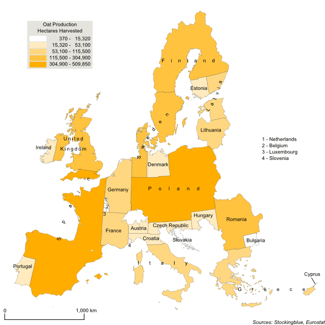
The cartogram above represents the size of the states of the EU based on the number of hectares they dedicate to harvesting oats, the larger the state the more hectares it dedicates to oat production. Spain dedicates the greatest amount of land but Poland is not far behind. These two countries combined account for just over one-third of the land dedicated to oat production in the EU.
Barley Production in the European Union
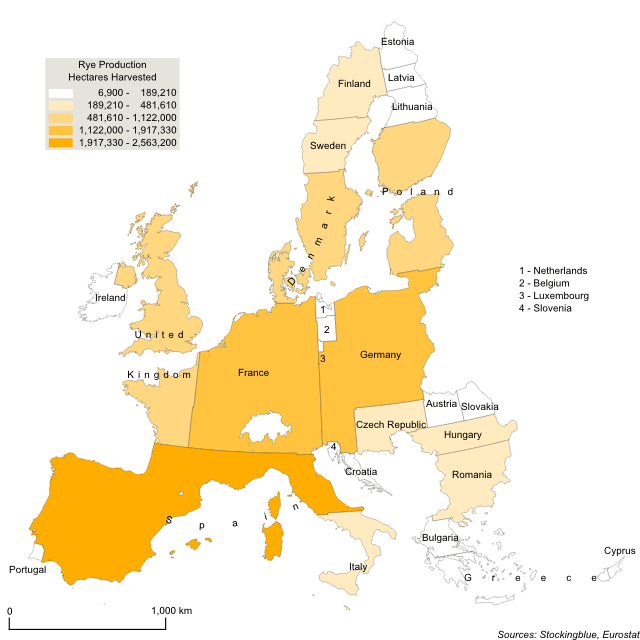
Today a look at barley production in the European Union. Spain dedicates the greatest amount of land but France and Germany are not far behind. These three countries combined account for just under half the land dedicated to barley production in the EU.
Rye Production in the European Union
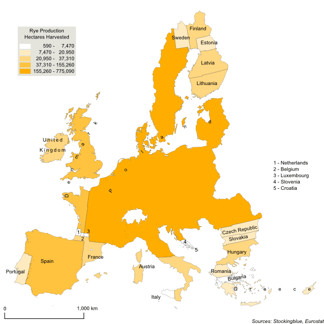
Today a look at rye production in the European Union. Poland dominates the EU with regard to the amount of land dedicated to the crop. It alone accounts for over half of the hectares that are dedicated to rye production in the Union. With Spain and Denmark, the three countries account for over three-fourths of the land dedicated to harvesting rye. There is one major caveat however, Eurostat has considered Germany's data unreliable for several years now and thus has not included data for Germany. Going back to 2009, the last year data for Germany is available, Germany allocated almost the same amount of land as Poland. So keep that in mind when viewing this map. A major producer is not included.
OlderNewer